
Combining the feature groups with customer journey

Grouping the contents in the feature list

UX Designer

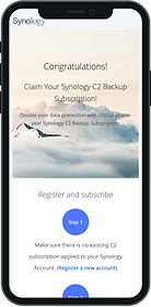

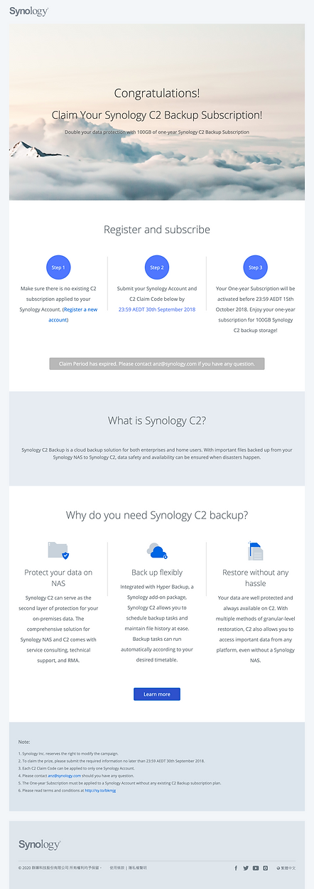
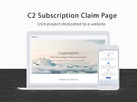
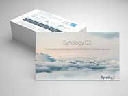
C2 Subscription Claim Page
Building a campaign website for free subscription redemption and Synology C2 promotion
Project Overview.
MY ROLE
Project lead: Marketing/ UX Designer/ PM
User research, User flow, Content Strategy, Wireframing, Usability testing
RESULT
A campaign page that attracted over 1M of exposure in 2 months
TIME SPENT
4 months | 2018. Jun-Sep.
TEAM
Front-end designer,
Web developer,
Sales, Product manager
Mission and Approach.
Goal: Build a marketing campaign page to give out redemption and promote a new product in 2 months
Targeting small and medium business users in the Australia market.
And identify customer needs by:
In-depth interviews with 5+ local onliners
Data analysis with 1M user records from the user data center
I mapped the identified users' need with our mission goals and extract 4 must-include elements in this website :
-
Claiming instruction
-
Call to action button (for redemption)
-
What is C2?
-
Why do you need C2?
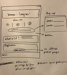

Prioritize and Sort Elements.
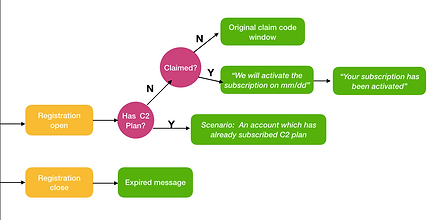
The Challenge: Incongruent Experience.
Due to the system limitation, users with redemption code cannot directly extend their subscription if they have already enrolled in a C2 plan... :(
This unexpected product issue troubled the redemption process, since the users would have to register another new account to claim the prize.
Summarizing the feedback from a colleague and local partners, I went to the product team to negotiate for modification. Unfortunately, my request was turned down due to the limited manpower and stacks of feature requests in the pipeline.
Hiccup took place here
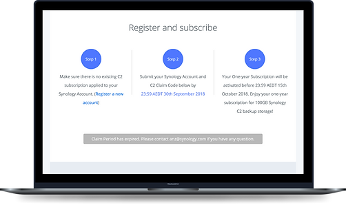
Workaround#1: Added Instruction and Enhanced Navigation Experience
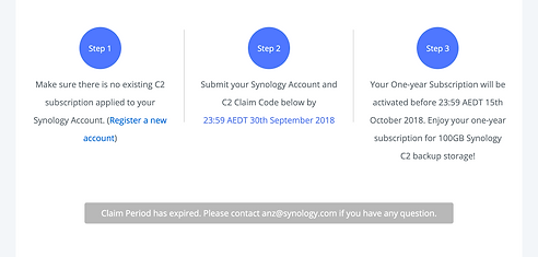
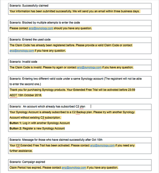
Sorted out all the possible scenarios
To deal with the incongruent experience, we aim to make the website more navigational. I looked into scenarios after a user clicks the redeem button, listed down all the possible user behavior, and devised additional feedback messages for each case.
Choice of terms: "Subscription" instead of "Free Trial"
After discussing with local partners, we changed the term to "free trial" to "free subscription" as it sounds like we are giving out a large prize to benefit our users.
Mapped every touchpoint to our task flow
Workaround#2: Descriptive Email
Building on the workaround#1, we decided to proactively reach out to users. After these purchasers finish registering to the free subscription, our system will send out an email telling them what to expect shortly.
Testing.
Every Synology release influences a large community. Therefore, rolling out this website, we tested:
With partners
With internal IT
With sales team
My team achieved over 1M of exposure within 2 months, and 100 purchases were made in Australia during the campaign period. Yay!
Learnings and Takeaways.
1.
Early communication and learn to translate marketing/design language
To facilitate cross-team collaboration, we have to translate marketing and design language.
2.
Negotiation and compromise
Product can't always be adjusted in the way we hope. Sometimes we will have to think out of the box and find a workaround.
3.
Find inspiration from universal experience
People like freebies and activities. We referenced a similar campaign run in Taiwan and replicated this model to Australia and New Zealand.
4.
If I have more time, I would...
Interview and test with more users. I would also try to negotiate with the product team to create a more cohesive experience.